Showing posts with label art. Show all posts

Friday, December 12, 2014

Scatter: Inspiration


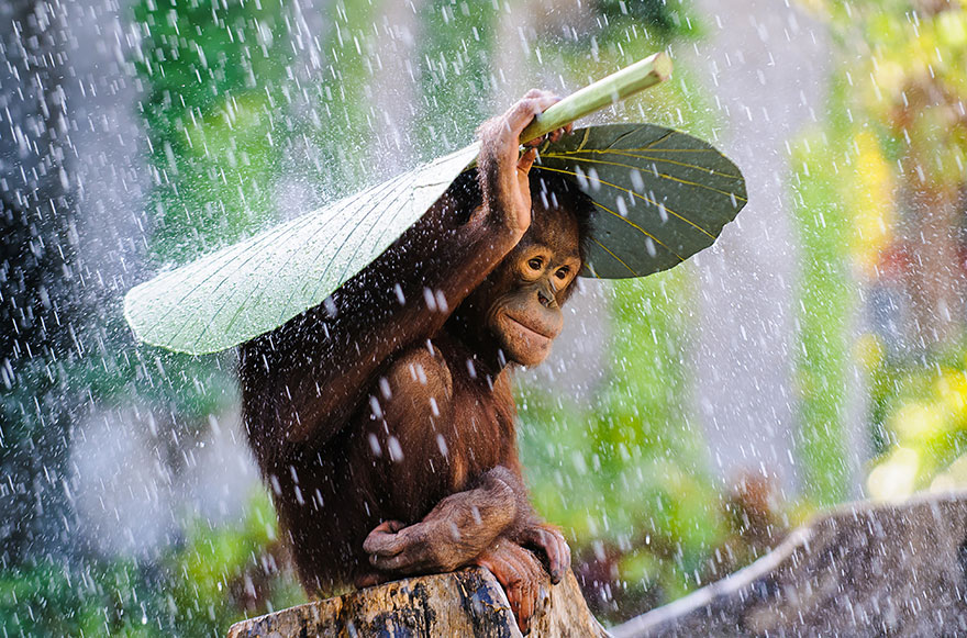
This sweet photo, "Orangutan in the Rain" is from a collection of the eighteen best entries to the Sony World Photography Awards. This is what photographer, Andrew Suryano, had to say about the moment:
“I was taking pictures of some Orangutans in Bali and then it started to rain. Just before I put my camera away, I saw this Orangutan took a banana leaf and put it on top on his head to protect himself from the rain! I immediately used my DSLR and telephoto lens to preserve this magic moment. Image location: Bali, Indonesia” 

Here are a couple more:

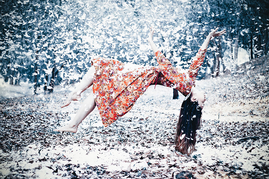
Times Are Hard for Dreamers


“Woman suspended in a mass of feathers.” Photo by Ahmad Zikri Mohamad Zuki, Malaysia

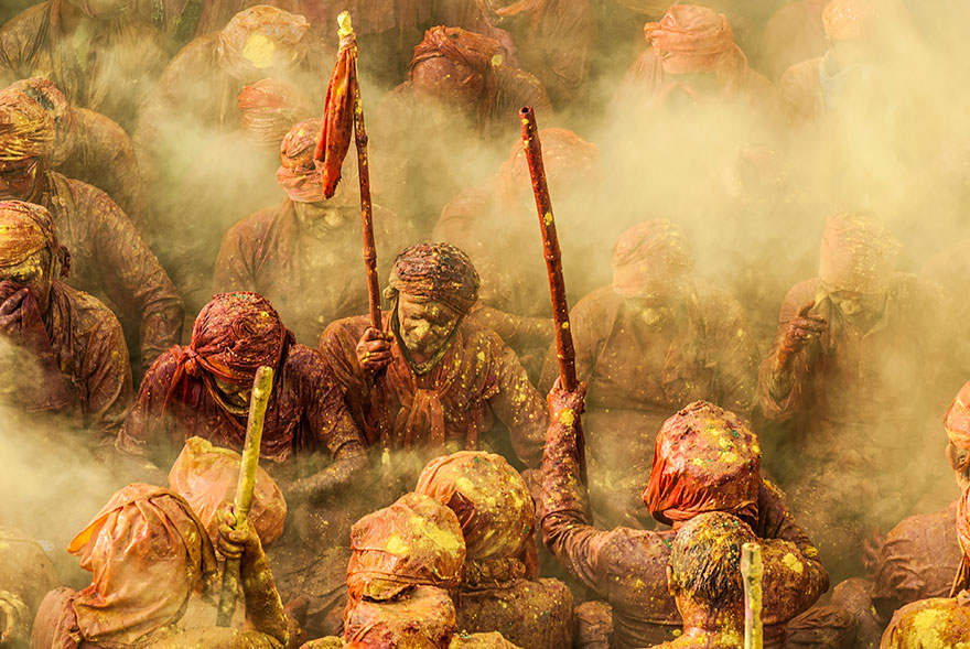
 Holi
“Hindu devotees throw vivid color at each other to celebrate the start of spring during Lathmar Holi Festival. Hindu brahmans from the village of Nandgaon are covered in colored powder as they sit and sing on the floor during prayers.” Photo by Ioulia Chvetsova, France

See more here.

And, on a slightly different note, Girls Illustrated by Nina Cosford: Yes.


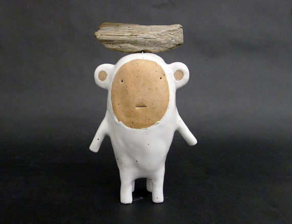
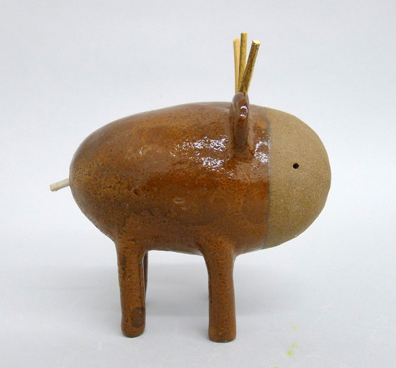
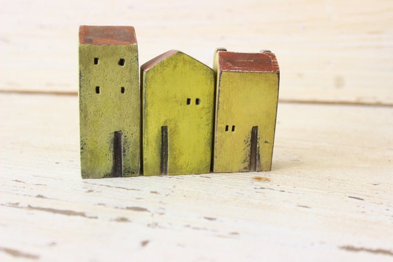
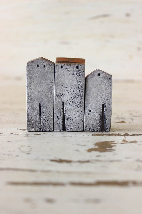
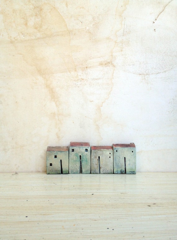
And because I can't stop looking at them, or dreaming about their little clay worlds, these amazing ceramic pieces from Etsy shops Coco & Pompon and Vesna Gusman ClayArt.

          This little guy is standing moute 399.

          Also, precious little Standing Moute 349

          And some of the sweetest little houses for our tiny ceramic friends:


Happy Friday everyone! I hope it's an inspired, restful weekend for you. I'm looking forward to a wintry walk outside, catching up with a dear friend, and working on a craft project for a special someone (updates coming soon). Stay warm, wherever you are. 


Monday, December 8, 2014

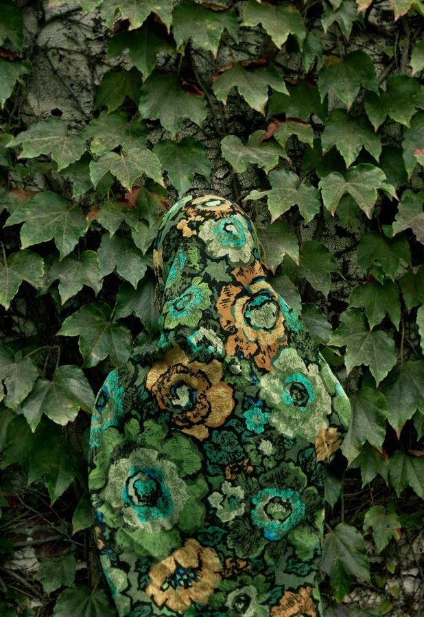
Monday Musings: Wallflowers


When I was four years old, we moved out of our green house on Walnut Street, and into the house I grew up in. It's a big home full of rooms and wall space, an ample backyard, and many stairs to climb between each floor. Our move was in the mid-eighties and wallpaper was a BIG deal. In fact, the look of big was a big deal--big prints, big hair, big suits with even bigger shoulder pads--they were all the rage. Some of us remember the color palette too--bright, bold, neon, jewel tones, and lots of black and white as we moved into the early 90's.

My mother, being a woman who loves color and pattern, and who was ever attentive to the styles and design trends of the time, took it upon herself to select wallpaper for each room of our new home, and then did the hard work of cutting and laying the paper against the walls--all by herself. I still remember her perched on a ladder, five months pregnant, finishing the blue floral walls of the nursery.

My sister and I shared a room back then, and at our request (I think it was our idea) it was papered in pink. A bright, Crayola crayon sort of pink. The quintessential "It's a Girl" pink. It remains this color still. There are flowers scattered throughout the pattern too, but truth be told, they have little voice against that bright hue.

I'll walk into that room now, usually just to jog my memory, I'll squint a little at first, and then I quietly turn off the light and close the door. It's not that I didn't love the space as a young person (I did, mostly), but now, I find the experience a tad jarring. That paper is a presence. It defines the room, wielding a power that I can't compete with as an adult.

The room wins, and that's okay. I don't sleep there anymore.

So I suppose I had lukewarm feelings for a while there, but in the last few years especially, wallpaper has reclaimed a new, happy place in my heart, particularly when it's a print or pattern that soothes, tells a story, or invites a newcomer to spend a little time interacting with the space.

The prints and patterns at Grow House Grow, a Brooklyn-based company founded by illustrator Katie Deedy, do just that--they transport you. Deedy specializes in "narrative-inspired" wallpaper design, and her inspiration board is one of the most beautiful Tumblr sites I've stumbled upon in the last year.

Check out more here:


Katie Deedy's wallpaper is printed by hand, and what I love about her story, in addition to her passion for storytelling, is that she started her business right out of own her kitchen--proof that creative goals can take shape anywhere, and at any time, if they're nurtured.

Here are a few of her prints:


Mesmerizing. Read more about Katie Deedy here. She also has some good advice for any aspiring artist. Have hope, my friends, the dream is possible.  Happy Monday!

(top photo: "Sun, Moon & Stars" via the International Center of Photography)

Tuesday, November 25, 2014

Do You Doodle?

When I'm gripped by a surge of inspiration, driven to the page by creative impulse, the results usually find their form in a slender string of lines--usually a scrawl of messy cursive. I try to jot the words down as quickly as I can, so as to remember their order and sequence, sometimes inside a tiny notebook that I keep on hand, or in one that rests beside me on the nightstand. And if these items fail to surface, I'll settle for the back of an envelope, the flip side of a bank statement, if I'm in a bar, the requisite whiskey-soaked napkin will suffice.

Regardless of their exact location, lines come and land on the page in mere seconds, and after that, it's up to me to decide what comes next. Are they worthy of more attention, or was the jotting down of them their sole purpose? If it's a longer piece I'm writing, perhaps they fit in somehow? Or, if they're entirely nonsensical, but the syntax is just right, maybe it's just a tiny amusement I file away under, "Jokes I tell Myself." One of my friends calls it "scribbling," and I like that. It takes some of the pressure off, in a way.

But for artists whose creative expression comes in shapes other than horizontal lines, while they may refer to their work as "doodling," the end result can often be awe-inspiring and sometimes startlingly beautiful.

When I taught English, I would sometimes notice the occasional student sketching a small drawing in the corner of a notebook. Rather than feel annoyed that said student may not be paying his or her full, undivided attention to whatever I was saying, instead I would find myself curious--sometimes to the point of distraction--to see what they were drawing. Doodles are inspiring. They rise up from some part of ourselves that feels free of imposed constraints, expectation, or the need to produce something worthy of an audience. Doodling, just like jotting lines, feels necessary. I've read several articles arguing that doodling can in fact help a person focus and aids in the learning process by opening different pathways in the brain, particularly when lots of information is being processed. So perhaps it is best to leave the doodling student to her craft.

Doodlers Anonymous, or DA, is blog-home for doodles, interviews, and themed-submissions, and it was started by OKAT and Hugo Seijas, who are also both self proclaimed doodlers. Artists like Gemma Capdevila, whose work is shown below, mix together whimsy, humor, and sometimes a bit of the absurd in their sketches, and many of them are stunning. It leads one to question where the line truly rests between doodles and, well, the other side of doodling?


So dreamy, right? 

Check out more gorgeous doodles here and here.

Wednesday, November 19, 2014

Found in Translation

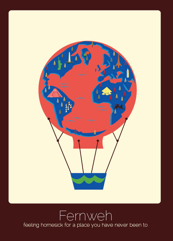
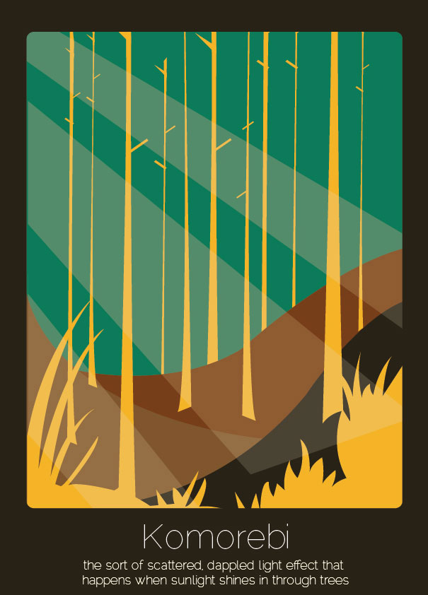
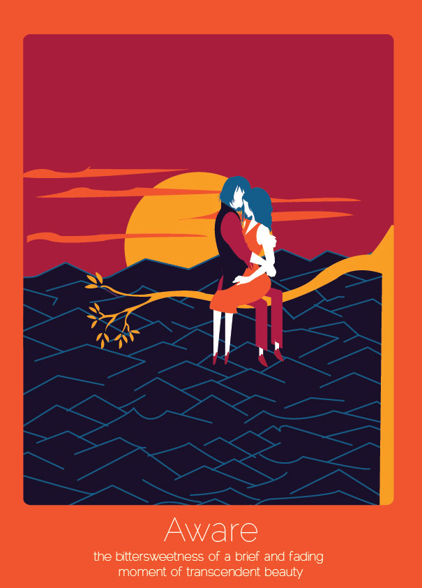
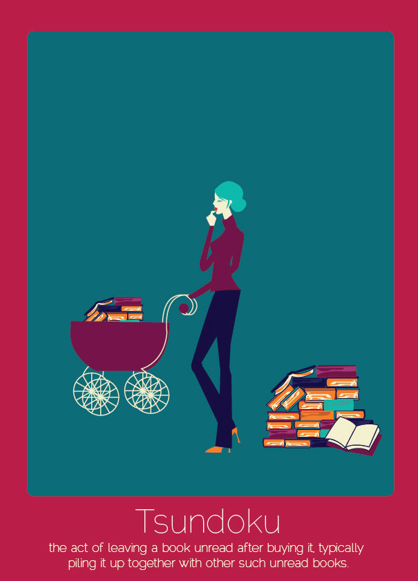
How cool are these illustrated words from New Zealand-based desinger, Anjana Iyer? The images represent the meaning of words that have no direct translation into English. My two favorites are Komorebi (the word reminds me of some of my favorite Ansel Adams' photographs), and Tsundoku (I'm guilty of this!)

Fernweh (German)


Komorebi (Japanese)


Aware (Japanese)


Tsundoku (Japanese)


See more illustrations here, and one of my favorite words. If it weren't so gorgeous right now with frosty sunlight glazing the trees outside, I might wish for a fresh rain--one of the best parts of living in Washington state.

Tuesday, November 18, 2014

Helvetica!

Seems I'm a tad late to the party on this one, since the film Helvetica was released in 2007 (what's a mere seven years?), but a delightful discovery it was last night, and fascinating stuff for anyone interested in design history. Produced and directed by Gary Hustwit, the film explores the origins of the type, Helvetica, featuring graphic designers and type artists with very strong opinions about the font--some who's designs are firmly tied to it, and a handful who absolutely disdain its sober, unaffected character. 

The film begins with an introduction to the Swiss designers who helped build the ubiquitous typeface and later shifts to designers who currently play with a more postmodern style, rejecting the clean, precise type that represents much of corporate America. 

I loved learning Helvetica's history, realizing as I watched just how much I've come to depend upon and expect the uniformity of the graphics around me. Consider the GAP logo or even our U.S. tax forms (all in Helvetica) and how, as one cast member put it, we find a sense of security in the way corporate signage seems to sort of hold or "contain" the chaos and messiness of the rest of our lives--how there exists a reassurance of control and order via the signposts and street markers around us. Those words with their straight lines, sans serif, are many layered in their semiotics.

There's a moment when one designer takes us through the pages of an old LIFE Magazine, highlighting examples of advertising from pre-Helvetica 1950's:


Of course the film also made me consider the font here in this space, and how it feels for a reader seeing words in one type versus another.  Lots to consider...

The film is available on Netflix (if you happened to miss it the last few years, like me). And the trailer:


What's your take on a serif font? Yay or nay? Do you have a go-to type? Happy wintery Tuesday to you!